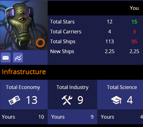
If I look at another player’s tech levels or other stats, my comparison value is highlighted red/green if it’s lower/higher. Why isn’t this done for the infrastructure totals?
If I look at another player’s tech levels or other stats, my comparison value is highlighted red/green if it’s lower/higher. Why isn’t this done for the infrastructure totals?
Probably because solid white looks much cleaner. Doesn’t really bother me tbh
Yes, It should I agree. I just never got around to doing it. Its on the todo list, but burred under lots of other things.