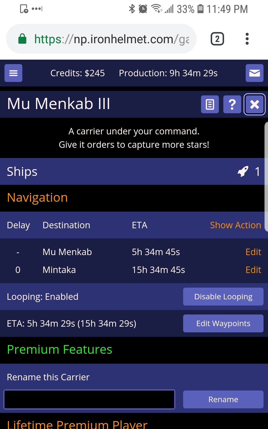
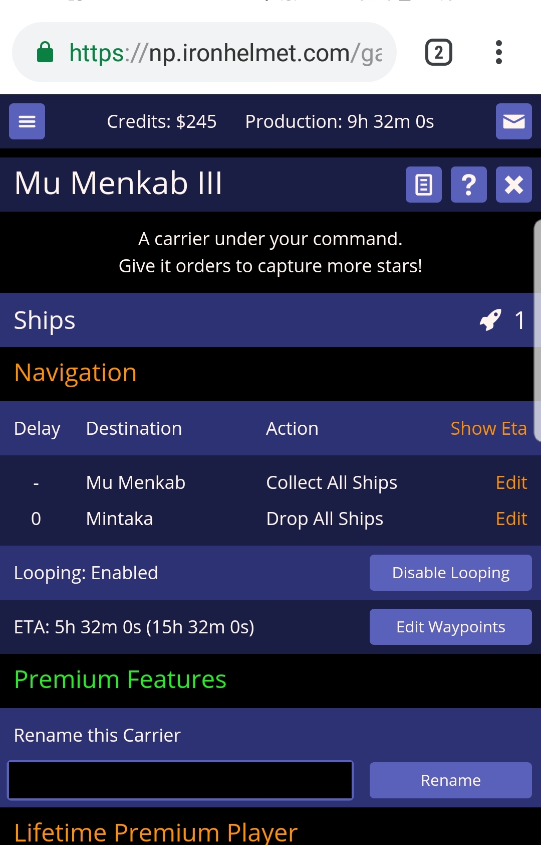
If you make the columns a bit narrower, couldn’t both those fields be displayed at once?
I couldn’t make it fit when I was designing it. One day I will design a UI for those of us on Desktops with nice wide screens.
I thought using the same icons as when setting waypoints could work, then adding a legend underneath it all so we know what the icons mean.
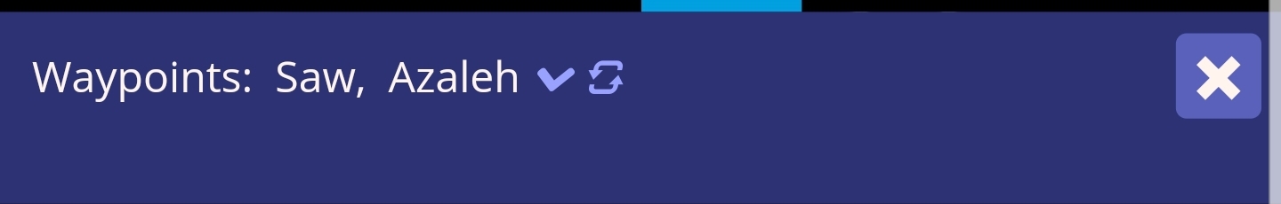
Azaleh(down arrow) when setting waypoints.
Could do the same in the navigation screen.
(eta) (down arrow icon)
Would be less space than “Drop all Ships”
Or maybe just use the icons anyway in the ETA column so we don’t have to switch, but can if we prefer to read what action it will take.
Or just get rid of the word “ships” as it’s kinda assumed. Instead of “Collect all Ships”, “Drop All Ships”, etc, just go with “Collect All” etc. Seems like there should be space even on my phone.
1 Like
Could also remove the “Edit” link text on each line and instead make the Action itself a link to edit the Action.
1 Like
That’s a good idea
He could even eliminate the edit screen completely if he wanted and change the action to dropdowns, delay to a text field to change the number then put the ETA where “edit” currently sits.
Would make it easier to edit, although I like the current editing where I can select the next star and it jumps to it and does the selection animation.
If they were dropdowns though, too easy to mess up, maybe change the current “show ETA” to “edit” which could take it from readonly to the dropdowns and text field.
I like the idea of the Edit/read only toggle button!
New here but I’d also be happy to see these changes if they came about.
I recently played with some friends who hadn’t played before and most of them “complained” about this (though the game was a roaring success!). One who had a different view has a tiny phone and had to scroll around to see everything as it is, so I guess some caution needed… but his phone is tiny…
_________________________[enable edits|v]
Delay__Destination__ETA/Action (tap to edit)
_–_____Mu Menkab___5h 34m 45s ^10
_0_____Mintaka______15h 34m 45s v
Tapping to edit would presumably show a dropdown of symbols alongside their text. They’re easy to learn so not having them written out there would probably be fine… (though 6^ vs ^6 is easy to miss at a glance, I’d prefer ^6 for pickup 6 and ^b6 for pickup all but 6 personally)
Is that what others envision?