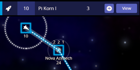
Currently, when you single click on a carrier you get this:
And if you click the + or press “W” then you get this:
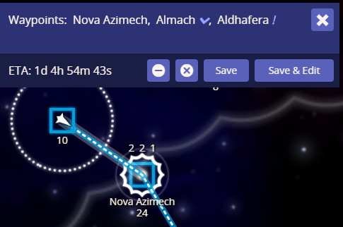
…which gives you more info on the path and what the carrier does at each star, along with more buttons to modify the path and go to the full edit screen. Why not have this come up by default when you single click on a carrier? Hardly takes any more screen space and for me would be preferable 90% of the time.
…the exception being when there are a cluster of ships and stars in a tight space and you get a list like this: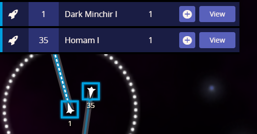
p.s. I know you’re not working on NP atm Jay…just want to get it down whilst I’m thinking about it!